

Material-UI is one of the most popular libraries used in React to take web or mobile apps to a new level. With the components from the Material-UI library, it’s very easy to make use of Material Design elements in your React web or mobile application. With its easy to use components, Material-UI also provides a lot of functionalities which saves a significant amount of time since the developers do not need to write everything from scratch.
Why use different components for different screen sizes?
Nowadays websites don’t limit to just laptops or PC’s they are also used on mobile devices. So along with responsiveness, they should be more like an app on a mobile device. The term “responsive” refers to responding to the user’s context and behavior by taking into account the different viewports sizes and devices.
CSS related responsiveness can be achieved by using media queries but rendering different components using media queries is difficult. So there might be a use case where two different components need to be shown to the user based on whether he/she is using a mobile or a PC.
Let's take an example
Suppose in a chat application, we have to display a message to the user to press Shift+ Enter to add a new line. This message is not useful when a user is using a mobile device to visit the website. For this, we can use window.innerHeight and window.innerWidth properties of JavaScript. But what if we want to display different messages on different breakpoints, it would be very time consuming to write code for each breakpoint.
To ease this process, we can use Material-UI’s Hidden component. Hidden component works based on responsive breakpoints . It is like a wrapper component that hides its children according to the breakpoints.
Let's implement something similar, we will show different messages to enable mic on different devices based on screen sizes.
First, create a React app and import Material-UI using the below code.
// with npm
npm install @material-ui/core

// with yarn
yarn add @material-ui/core
Now let's import Hidden from Material-UI
import Hidden from '@material-ui/core/Hidden';
App.js
export default function App() {
return (
<div className="App">
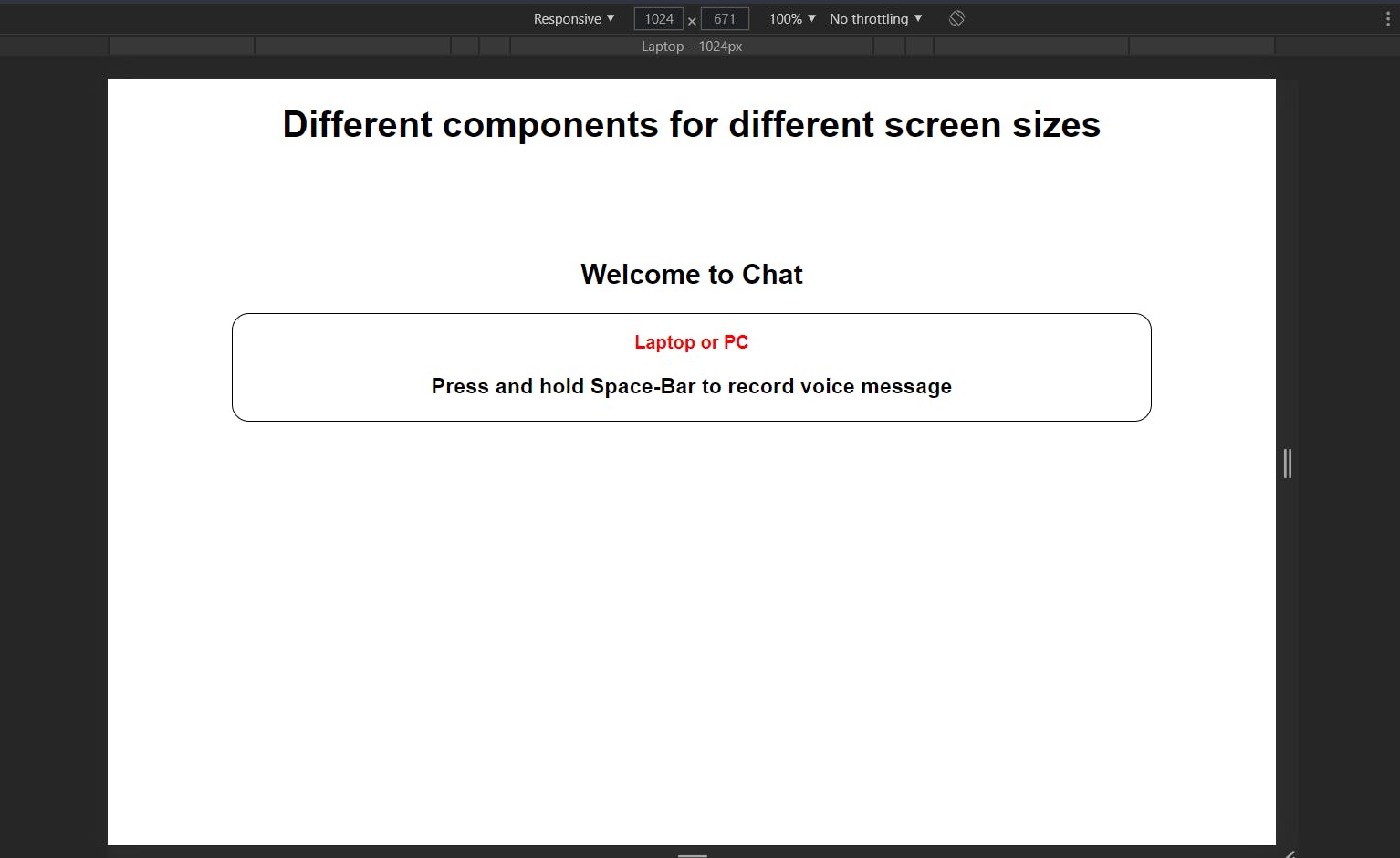
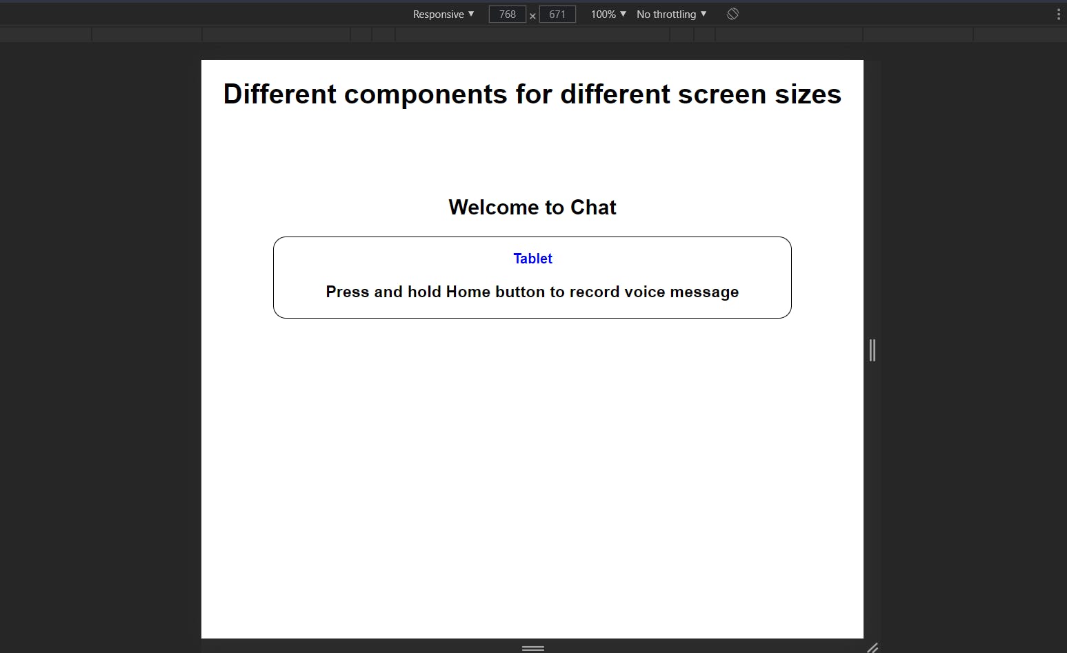
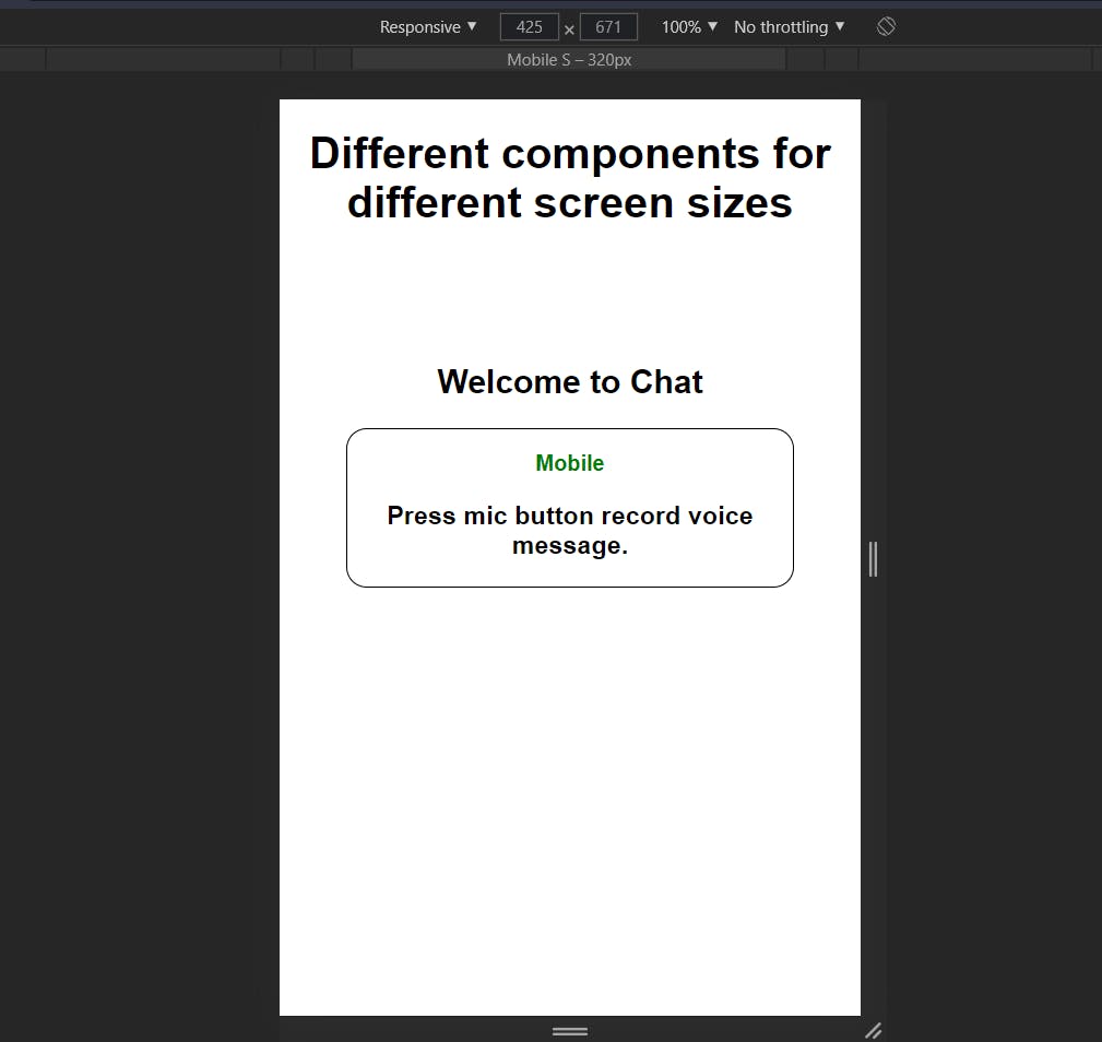
<h1>Different components for different screen sizes</h1>
<h2> Welcome to Chat</h2>
<Hidden smDown>
<div className="container first">
<p style={{ color: "red" }}>Laptop or PC</p>
<h3>Press and hold Space-Bar to record voice message</h3>
</div>
</Hidden>
<Hidden xsDown mdUp>
<div className="container second">
<p style={{ color: "blue" }}>Tablet</p>
<h3>Press and hold Home button to record voice message</h3>
</div>
</Hidden>
<Hidden smUp>
<div className="container third">
<p style={{ color: "green" }}>Mobile</p>
<h3>Press mic button record voice message.</h3>
</div>
</Hidden>
</div>
);
}
We have created three different blocks of code wrapped inside separate Hidden components.
Understanding Props of Hidden component
We will just discuss props that are used in the above code, you can read about other props in Material-UI docs .
Before understanding props, xs, sm, md, lg, xlg are breakpoints used in Material-UI. You can read more about breakpoints here .
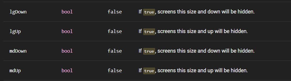
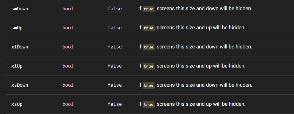
Down - when above breakpoints suffixed with Down mean that the component will be hidden when the screen size is equal to or below that breakpoint. For example, in the above code xsDown means that the component will be hidden when screen size equal to or less than xs breakpoint.
Up - when above breakpoints suffixed with Down mean that the component will be hidden when the screen size is equal to or above that breakpoint. For example, in the above code smUp means that the component will be hidden when screen size equal to or less than xs breakpoint i.e it will be only visible when the device is a mobile device.
These are some of the props -
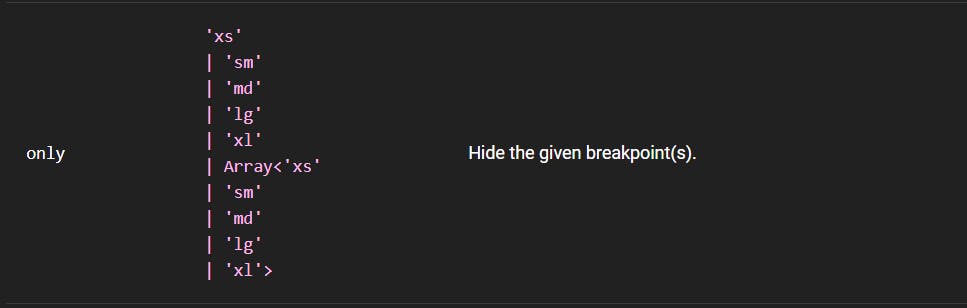
 You can also use "only" prop if you want to hide that component for a specific breakpoint instead of a range.
In our code, in div with class name "first" which we have to show only for Laptop and Pc, we have passed smDown as props which means that it will be hidden when screen size is less than or equal to sm breakpoint.
Similarly, in the div with class name "second", which is for tablets only, we have passed xsDown mdUp props which means that it will be hidden when breakpoint is below xs and above md and in the div with class name "third", which is for mobile only, we have passed smUp as prop which means that it will be hidden when screen size is equal to or above sm.
Result

This was a very short example, but Hidden component can be used to render entirely different page based on screen size which would be very difficult to implement using vanilla JavaScript.
Link to the full code is here https://codesandbox.io/s/different-components-for-different-sizes-react-vng7c
Hope you liked this blog. Happy Coding!!!