Table of contents
Flexbox is a CSS layout model used for aligning group of items in a container more efficiently. Flexbox allows the container to alter the width, height, and order of items inside it. It is also used to make the website responsive as it gives freedom to the container to adjust inner items according to device dimensions.
Flexbox is not just a single property in CSS, it contains certain properties which are applied to both container and the items inside the container. Let's understand these properties with an example.
<stye>
      .container{
          width: 100%;
          height: 80vh;
          border: 2px solid cyan;
      }
      .box{
          width: 160px;
          height: 160px;
      }
      img{
          border-radius: 75px;
          width: 160px;
          height: 160px;
      }
</style>
<div class="container">
        <div class="box box1">
            <img src="./purple.png" alt="">
        </div>
        <div class="box box2">
            <img src="./black.png" alt="">
        </div>
        <div class="box box3">
            <img src="./index.png" alt="">
        </div>
</div>
This is how it looks
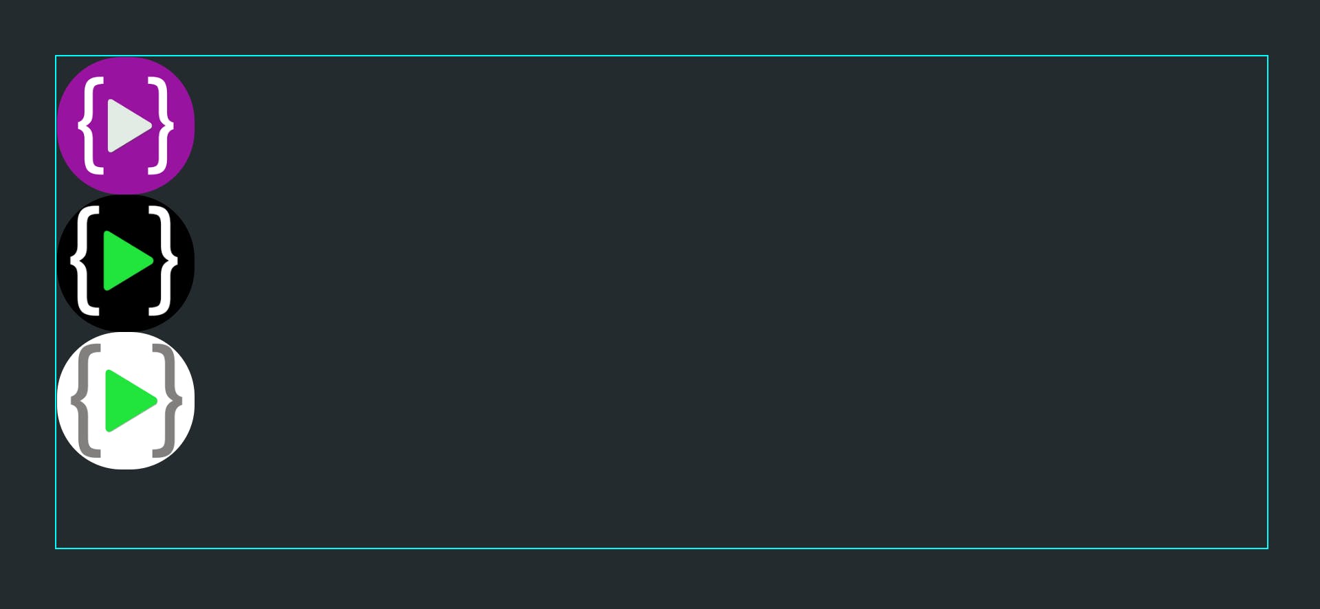 As div is a block-level element by default so it always starts at a new line i.e they are not aligned side by side. So if we change the
 display property toinline it will work like inline elements and bring all logos side by side, but the problem in this approach is that we have to add display:inline to all elements present inside the container. This won't be a correct approach as we might not know how many elements are in the container. For this we can use flexbox as in flexbox we have to add display:flex to the container only. Let's understand more properties that can be added to containers and inner items.
Container Properties
For a container to use the flexbox layout below property should be added to it.
display:flex
display: flex;
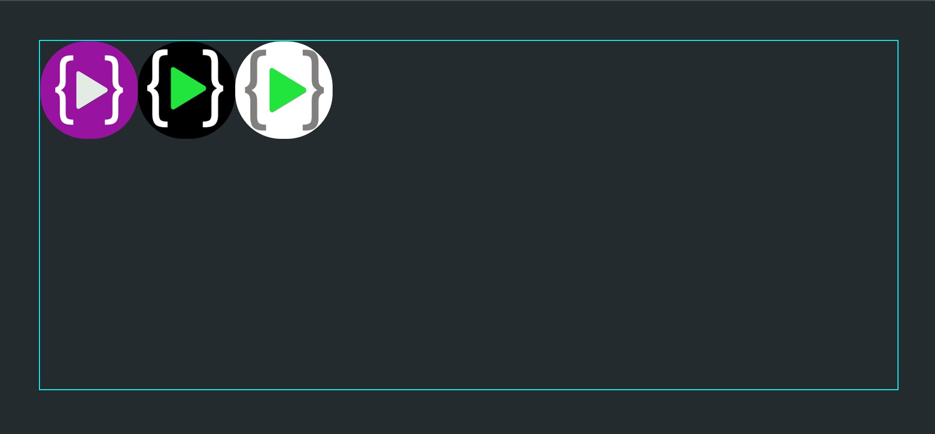
After adding display: flex to the container we will see the below result.
flex-direction
Flex direction is the direction in which the items are aligned.
flex-direction: row| row-reverse| column| column-reverse
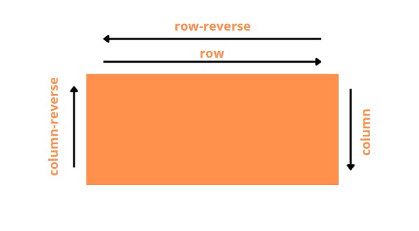 By default, flex-direction is set to row which is why items are aligned horizontally.
column
.container{
     display: flex;
     flex-direction: column;
}
 Now the direction has changed to column and items are aligned vertically.
row-reverse
.container{
     display: flex;
     flex-direction: row-reverse;
}
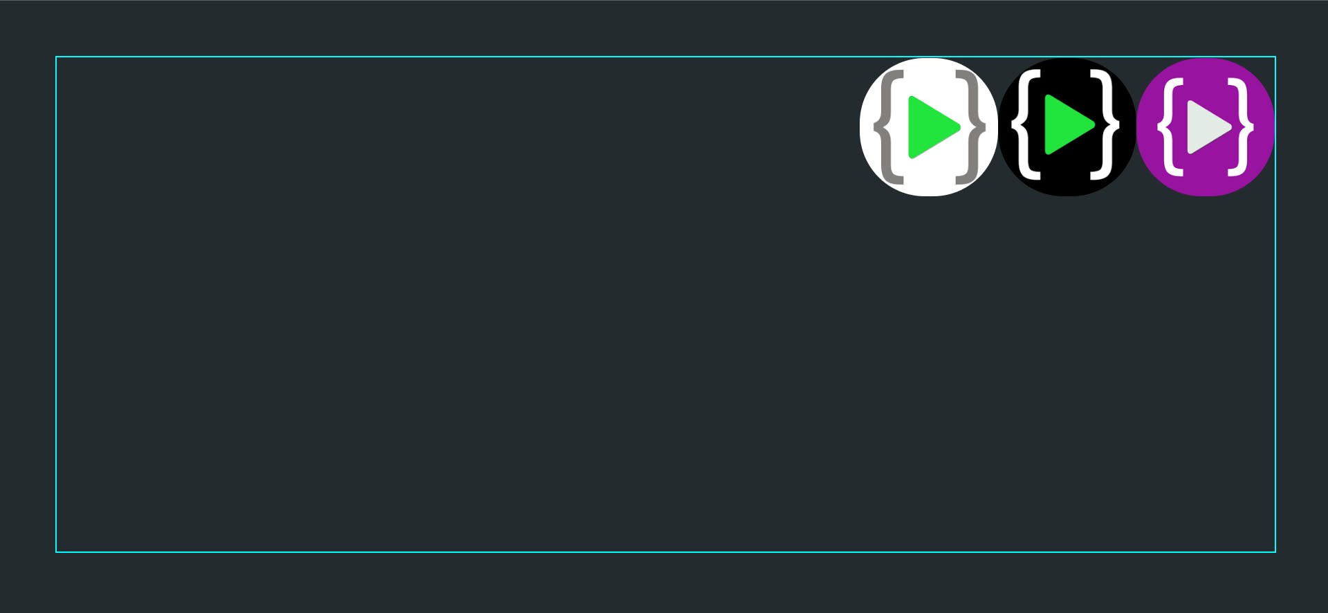 This reverses the direction of a row from left-to-right to right-to-left and hence the order of items is also changed.
column-reverse
.container{
     display: flex;
     flex-direction: column-reverse;
}
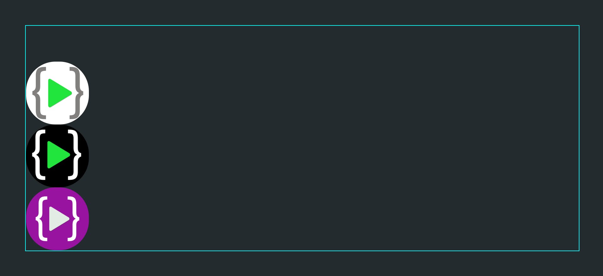 Similar to row-reverse, this changes the direction of the column from up-to-down to down-to-up.
justify-content
justify-content is used to adjust the position of items on the main axis.
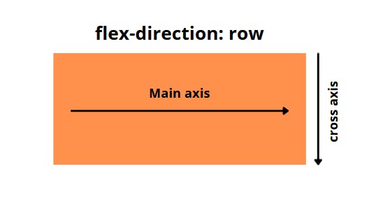
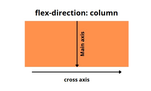 Main axis changes according to flex-direction, and justify-content is applied according to the main axis.
flex-start is default value.
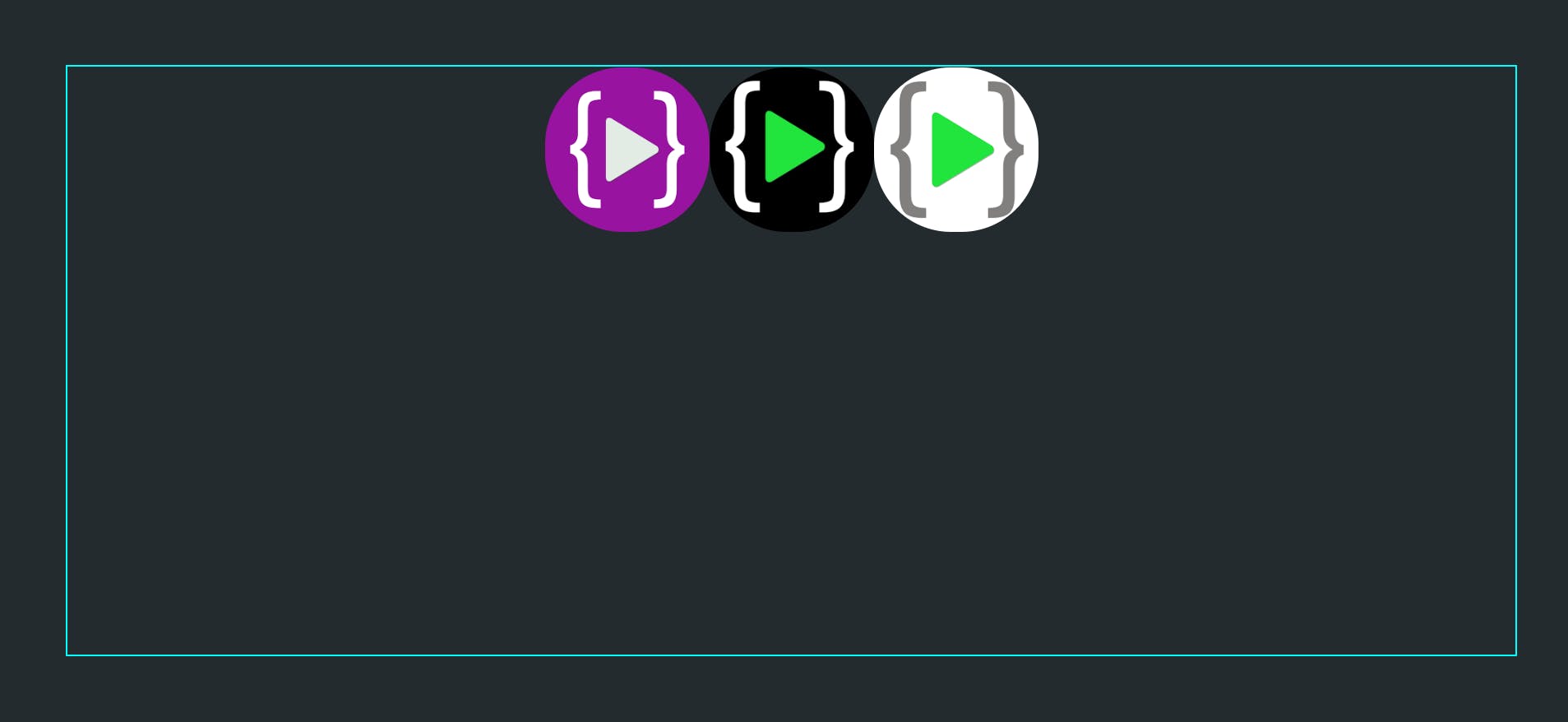
center
.container{
    display: flex;
    justify-content: center;
}
flex-end
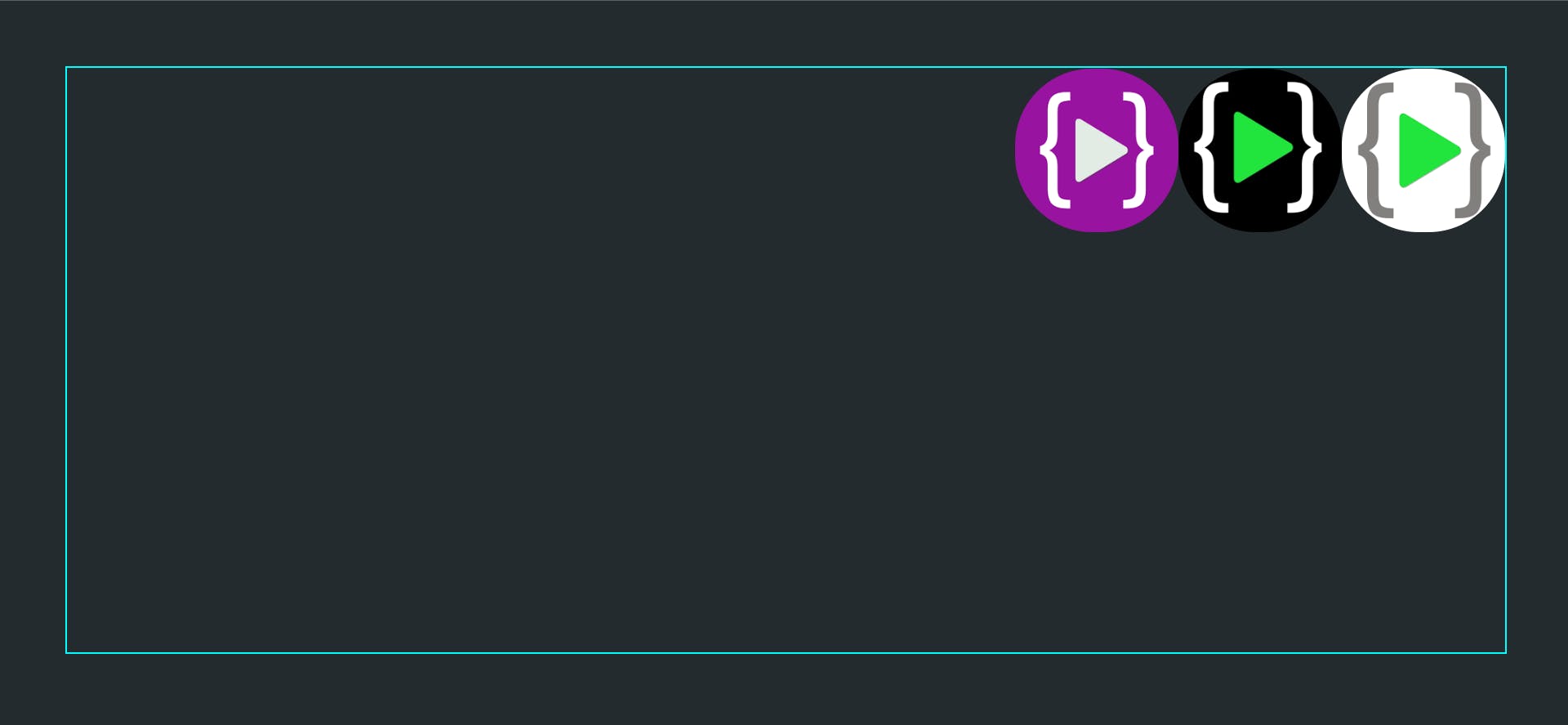
Items are moved towards the end of flex-direction.
.container{
    display: flex;
    justify-content: flex-end;
}
space-between
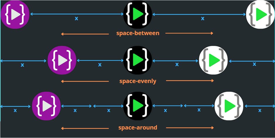
space-between distributes items on the main axis keeping space between the items and the first item being at the start of the axis and the last item at end of the axis.
.container{
    display: flex;
    justify-content: space-between;
}
space-evenly
space-evenly distributes items on the main axis keeping equal space between items themselves and between items and the ends of the axis.
.container{
    display: flex;
    justify-content: space-evenly;
}
space-around
space-around distributes items on the main axis with an equal amount of space around each item. This means that the first and last item would be spaced x unit away from the edge of container, but the space between any two elements will be 2x as each element has x space around itself.
.container{
    display: flex;
    justify-content: space-around;
}
 These were the commonly used values for justify-content, there are more values that you can check at MDN docs.
align-items
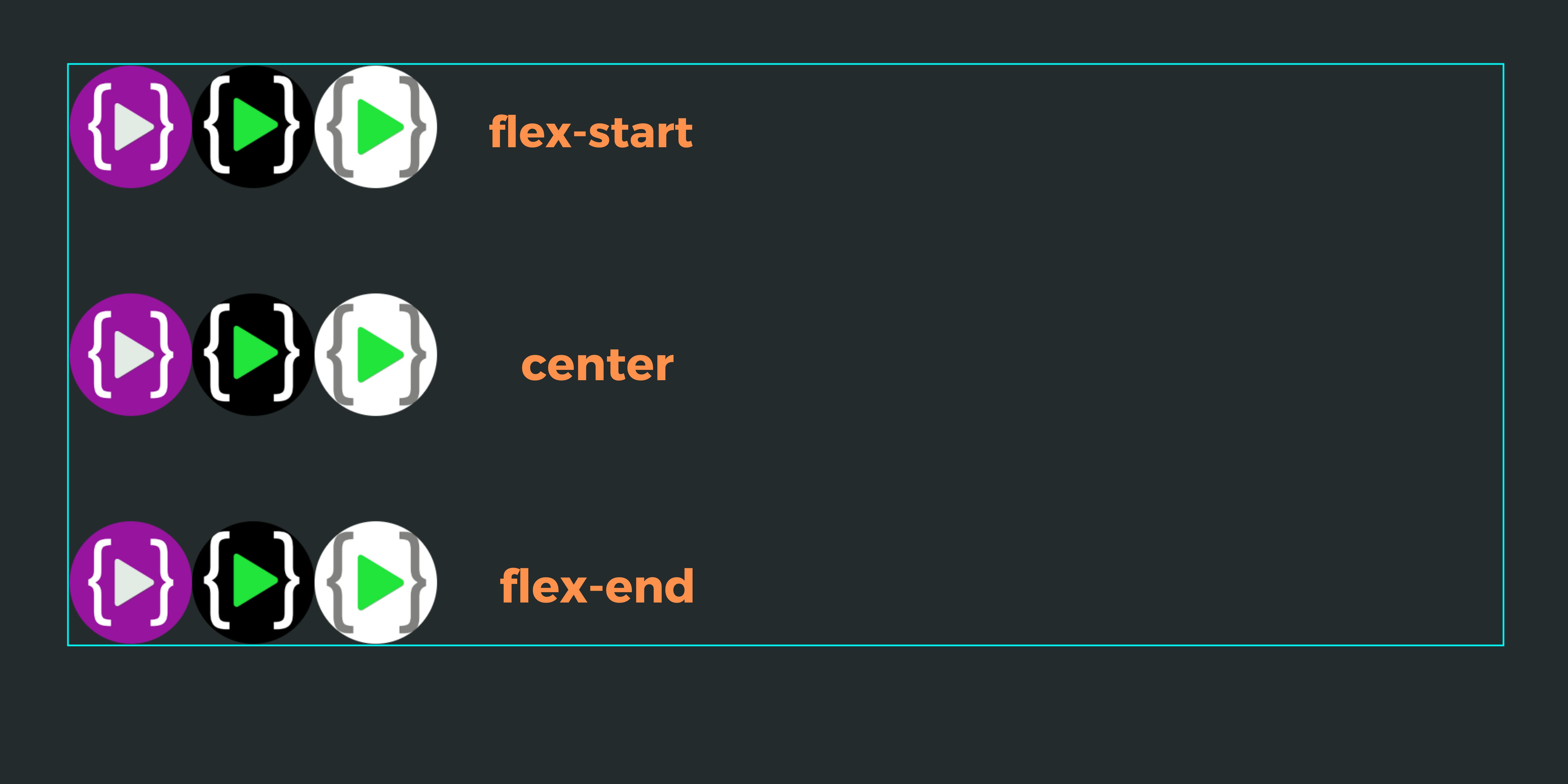
align-items is used to adjust the position of items on the cross axis. align-items is always applied according to the cross axis.
Note: align-items only has an effect if the container has flex-wrap property is set to wrap or wrap-reverse or if the container has more space for items to move inside it.
flex-start
Items are aligned at the start of the cross axis.
.container{
  display: flex;
  align-items: flex-start;
}
center
Items are aligned to the center on the cross axis.
.container{
  display: flex;
  align-items: center;
}
flex-end
Items are aligned at the end of the cross axis.
.container{
  display: flex;
  align-items: flex-end;
}
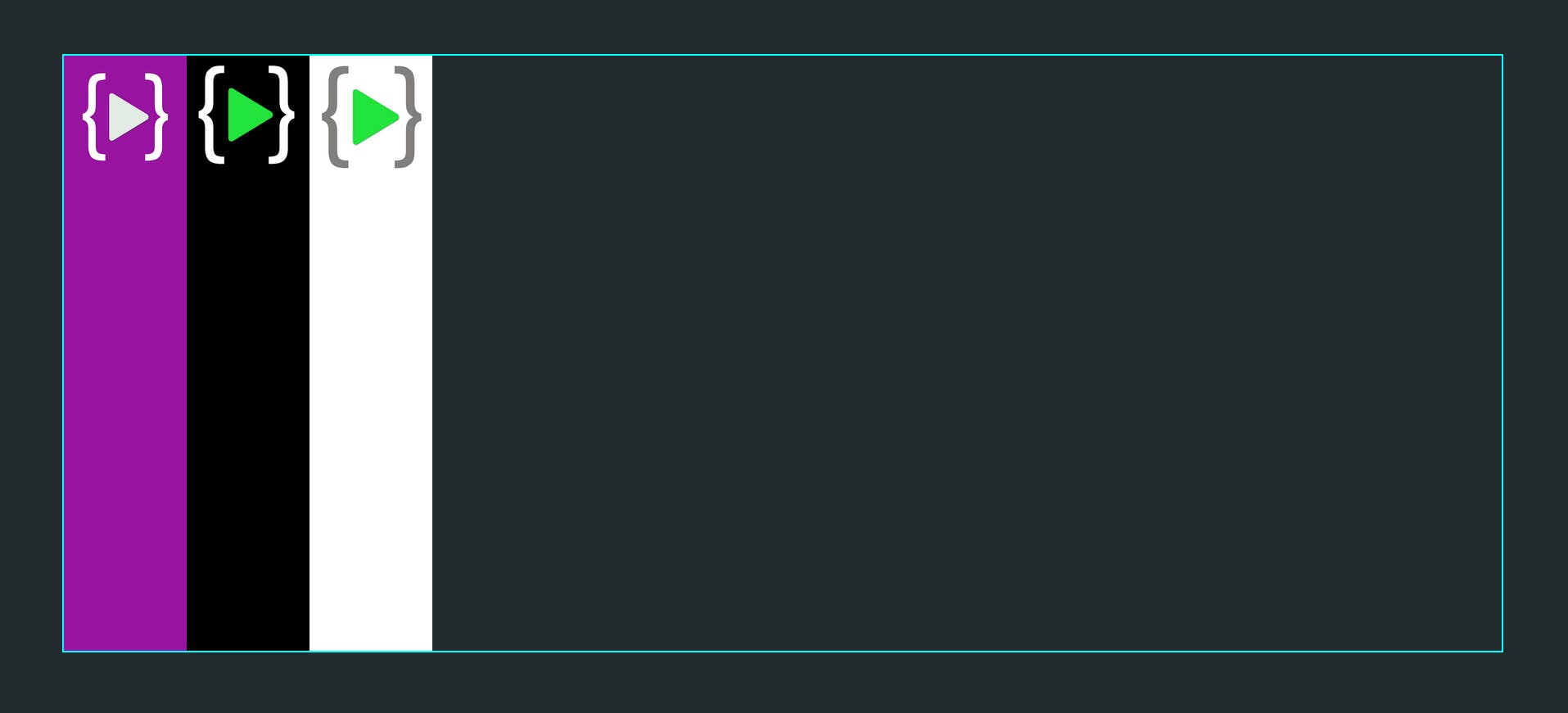
stretch
This is the default value of align-items. Items are stretched to occupy the entire space available on the cross axis but still follow min/max width and height properties.
.container{
  display: flex;
  align-items: stretch /*default*/;
}
flex-wrap
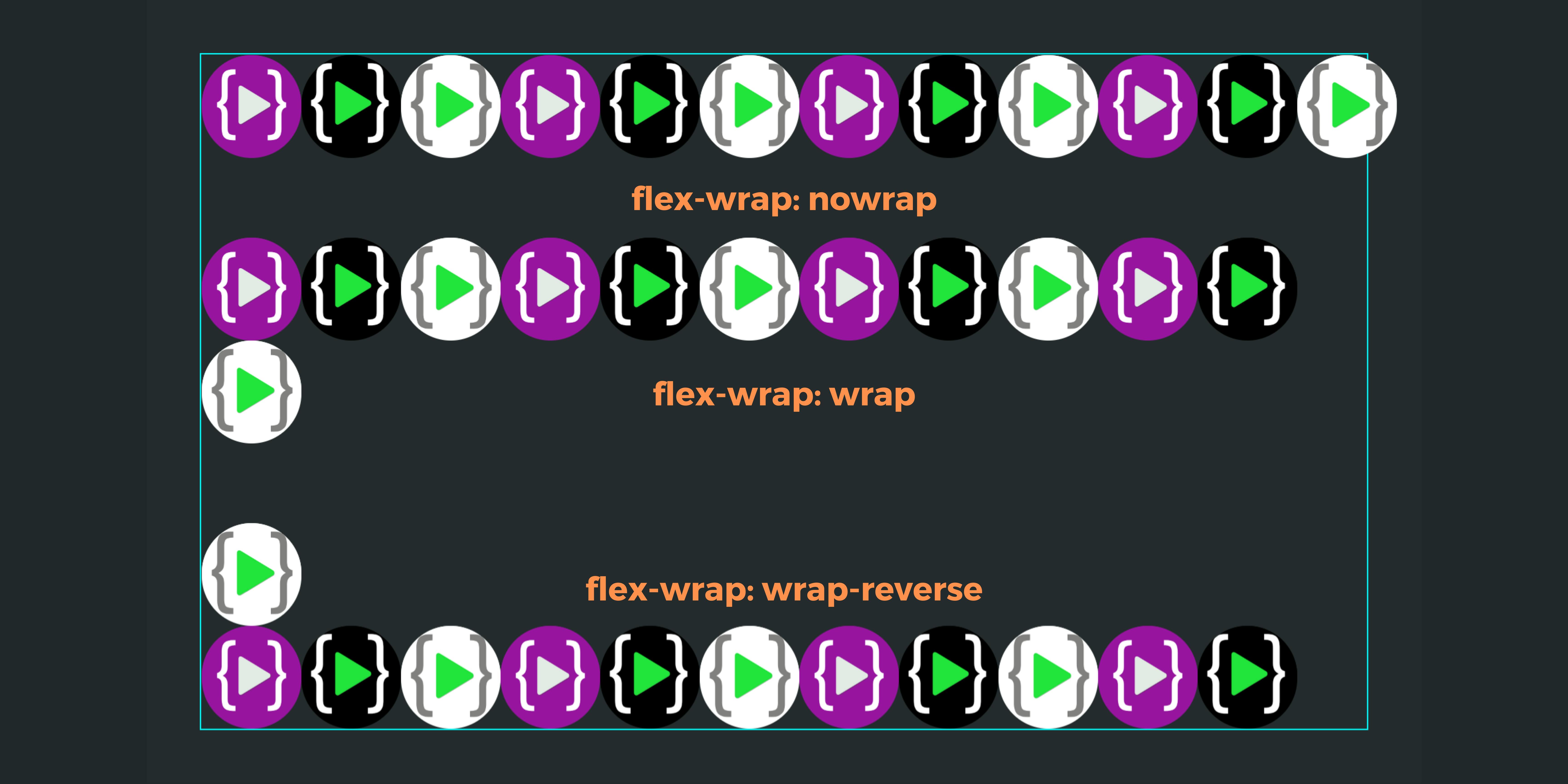
By default, all items try to fit in one line, which may change the original width and height of an item or they may flow out of the container. By setting flex-wrap: wrap container allows items to be in their original size and if no space is left for some items push them to the next line. This property helps to make web pages mobile responsive.
nowrap
This is default value of flex-wrap.
.container{
   display: flex;
   flex-wrap: nowrap;
}
wrap
This wraps extra items which do not fit in the container to the new row. Creates a new row below the existing row.
.container{
   display: flex;
   flex-wrap: wrap;
}
wrap-reverse
Works similar to wrap, only difference is new row is created above the existing row.
.container{
   display: flex;
   flex-wrap: wrap-reverse;
}
Children properties
order
Order property is used to control the order in which the items are displayed. By default order of items is set according to the document flow. order property takes a number as a value. The default value of order is set 0. Higher the value of order, more the item will be shifted towards the end. Similarly lower the number more the item will be shifted towards the start.
.box1{
   order: 3
}
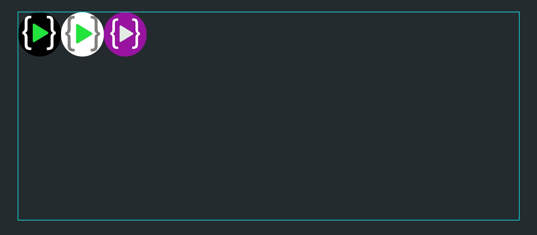 As you can see order of purple logo is changed and it is shifted to 3rd position. This is because other two logos have default value of order i.e 0 and 3 being greater than 0 the item is shifted to the end.
We can even use negative numbers as a value of order
.box1{
   order: 3
}
.box3{
   order: -1;
}
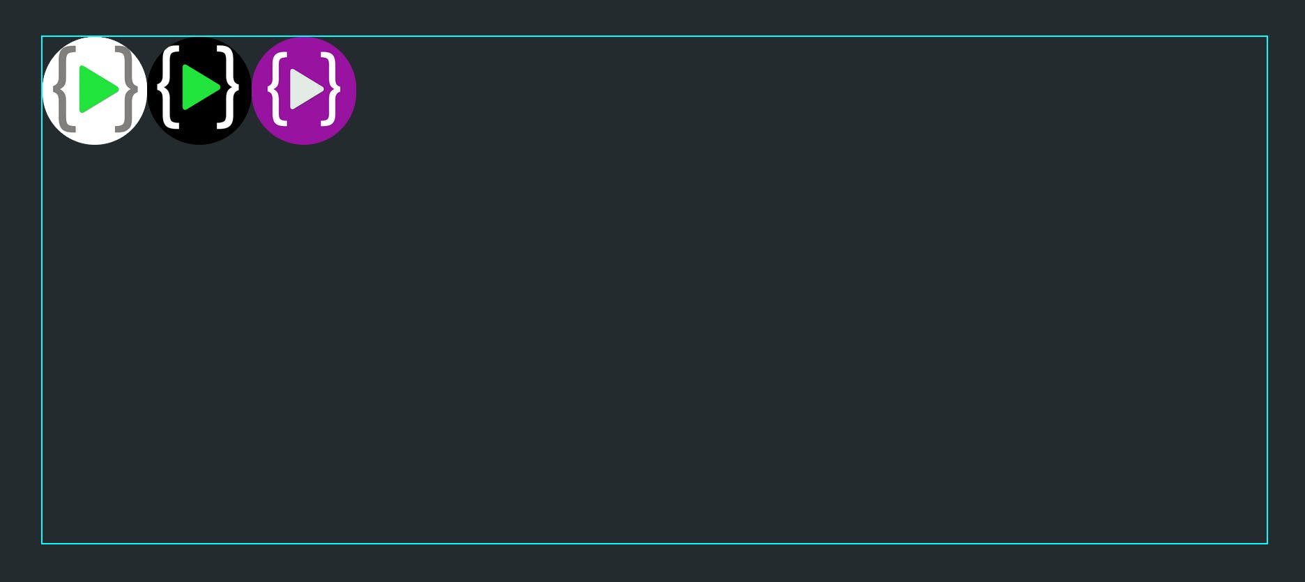 Now the order of the white logo is changed and it is shifted to start as it has an order value less than the other two logos.
Items with the same value will be placed according to the document flow.
flex-grow
It allows items to grow if necessary and take whatever space is available. It is a unitless value that is set to 0 by default. flex item with greater value will take more size as compared to other items. If all items have an equal value set, then all items will grow to equal size.
.box1{
   flex-grow: 1
}
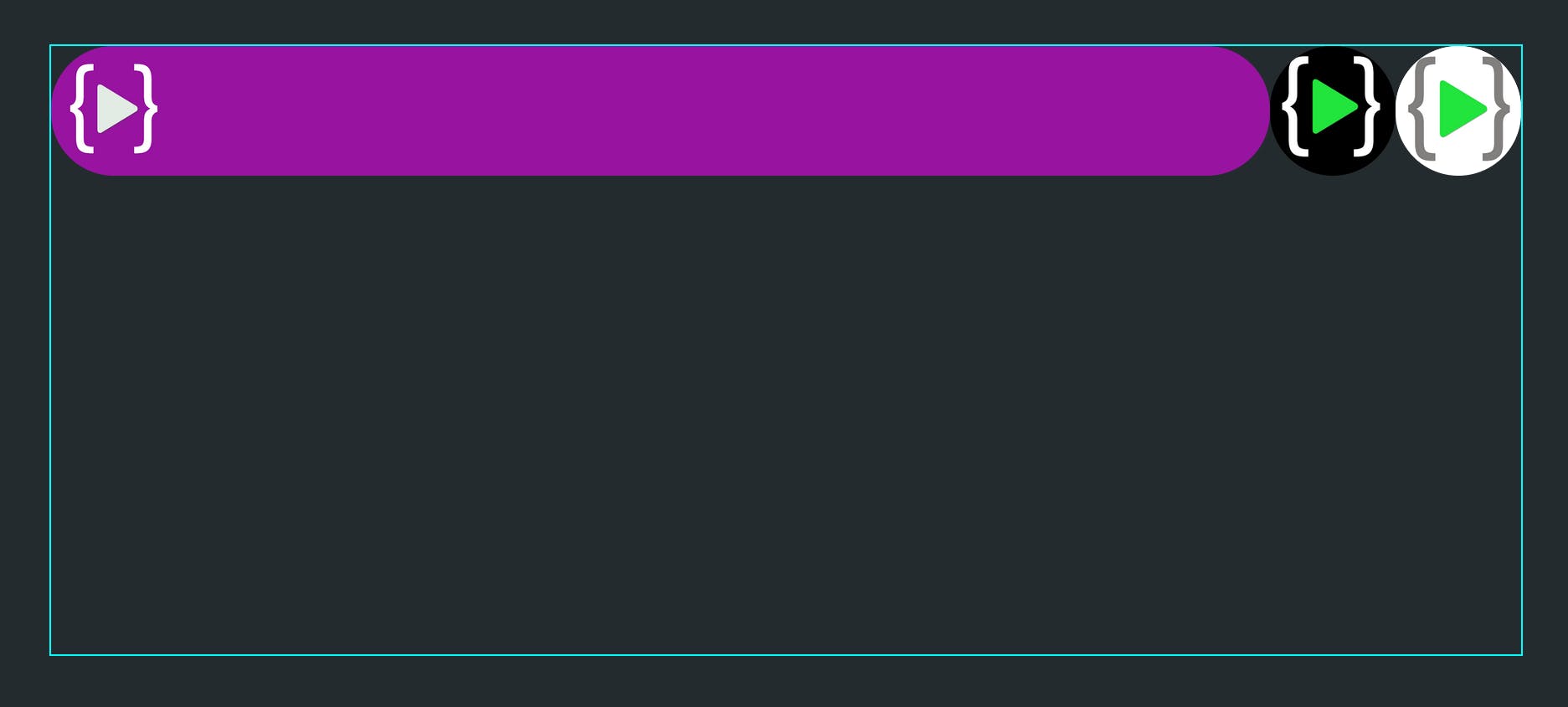 Here box1 has
 flex-grow: 1 and others having default value 0, box1 grows and takes up the entire space available.
.box1{
  flex-grow: 1;
}
.box2{
  flex-grow: 2;
}
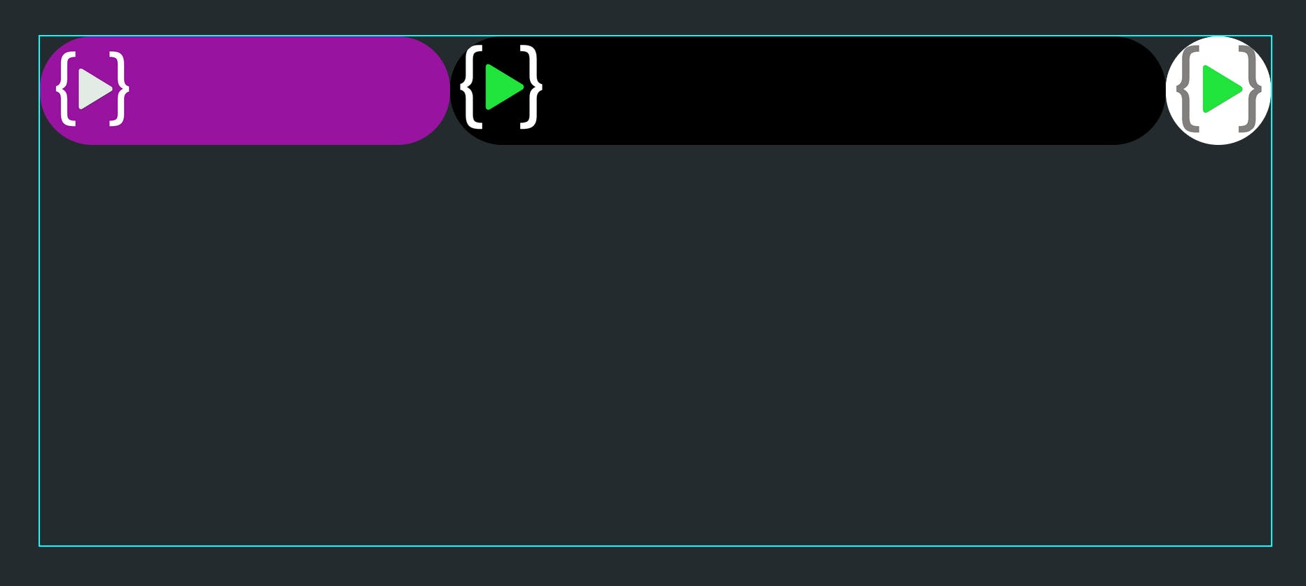 Here as box2 has greater value than othere boxes it takes up more space and box1 takes more space than box3.
So flex-grow serves as a proportion and items grow in these proportions.
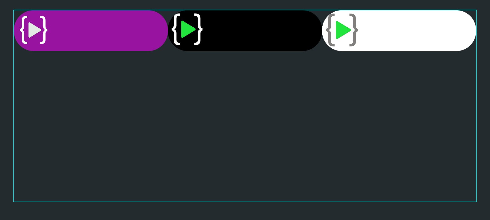
When
 flex-grow: 1 is set to all boxes, all boxes groow to equal size.
.box1{
  flex-grow: 1;
}
.box2{
  flex-grow: 1;
}
.box3{
  flex-grow: 1;
}
flex-shrink
It allows items to shrink if necessary. Works similar to flex-grow, just instead of growing items shrink.
.box1{
  flex-shrink: 2; /*default is 1*/
}
flex-basis
This is used to define the size of an element which it should be before the remaining space is distributed. The value can be in percentages(eg. 50%), numbers(40px or 10rem) or keyword. Keyword auto says that use my width and height property of that item.
.box1 {
  flex-basis:  | auto; /* default auto */
}
flex
It is a shorthand used for flex-grow, flex-shrink, and flex-basis combined together.
flex: [<'flex-grow'> <'flex-shrink'> <'flex-basis'>];
The second and third parameters (flex-shrink and flex-basis) are optional. The default is 0 1 auto, but if you set it with a single number value, like flex: 5;, that changes the flex-basis to 0%, so it’s like setting flex-grow: 5; flex-shrink: 1; flex-basis: 0%.
align-self
This allows aligning an item by overriding the value defined by the align-items property of the container.
.container{
   display: flex;
   align-items: center;
}
.box2{
    align-self: flex-end;
}
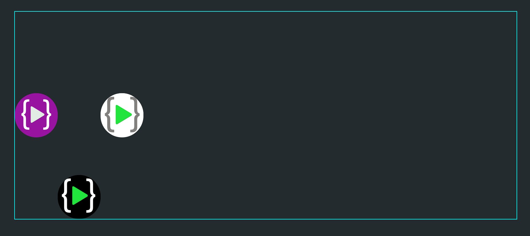 box2 has
 align-self: flex-end so it overrides the value align-items: center set by the container and aligns box2 to flex-end.
Flexbox makes it easy to adjust the position of elements by automatically adjusting the elements according to the size of the container. You can read more about Flexbox from the official documentation.
Happy Coding !!!🧑💻
